
How can we convert one-off donators into active members of Cancer Council?
Our goal for the project was to attract and retain users by forming deeper relationships with them, and we used that as the premise behind re-thinking and re-designing the user experience of the website.
Our high level goals were to:
Connect to users and give them reasons to get involved and become members.
Make the website easy for everyone, everywhere to use.
Modernise and streamline the experience.
My responsibilities
user research and testing
ideation and design
prototyping
Starting from scratch
Without any pre-existing insights, we reached out to the Senior Executive of Individual Giving at the Children’s Cancer Institute via email to shed light on people’s donating habits and reasons that people stop being involved with a charity.
How do people choose which charity to join?
Main reasons people stop being a member:

Donators don’t know how their money is being spent
People value transparency and want to see how they are contributing to a cause. They feel skeptical that their money is being spent on what the charity claims.
What is important to people when joining a charity?
The values of the charity align with their own
If they feel a personal connection to the mission of the charity
Transparency

Poor service and communication
People are frustrated by the lack of contact from the charity; it makes them feel disconnected.

Never received thanks
People want to receive gratitude for their contributions and to feel appreciated for their efforts.
Let’s compare the websites of different charities
We compared Cancer Council’s website to Red Cross, Unicef, and World Vision, focusing specifically on the information architecture, home page layout, donating, and the membership processes.


We found that in comparison to other charities, Cancer Council’s website was
difficult to navigate
the mission and values were not clear, and
the membership process was outdated.
You can’t build great experiences without knowing who you’re creating for
Putting a face to our users
The information and patterns we collected from our user interviews served to help us create our 3 main personas. We decided to focus only on Jason for the user journey as the goal for this project was to convert one-off donators to active members. We did this to identify exactly where in the process his pain points were.

Now that we know why, how, and who we were designing for and their pain points, we started thinking about how to translate that into the design solution.
Making it relevant and accessible
We redesigned the website with a mobile-first approach, modernising and streamlining the experience making it easier for everyone to use everywhere.


Low-fidelity digital prototypes were created for 3 scenarios:
donating
finding out about what Cancer Council does, and
becoming a member.
Version 1

Version 2

Users connected more to version 1, citing a more friendly UI and feeling more connected to the branding, iconography, and colours.
Giving Cancer Council a cause, giving users a reason
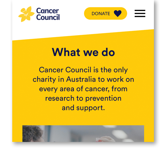
There was an opportunity to surface the Cancer Council’s purpose and mission statement to increase visibility. This is currently hidden in contrast to other charities where it was a focus.
By putting the purpose and mission statement on the home page, upon visiting the website users are given a reason to connect and care.

We added brief overview of their purpose on the home page with a link directly below to read more.

The mission is now placed on the home page
Clearer call-to-actions means lesser drop-offs
If users can’t locate where something is or struggle with completing a task, they’re not likely to spend their time navigating through a broken website, especially if they feel they are already doing a service.
To reduce the drop-off, date we had to make finding information and simplify the donating and membership processes.
The simpler it was to do something, the longer people stayed invested.


Being more direct to incentivise users
One thing we noticed very early on is that users don’t have an incentive for becoming a member. Furthermore, they had very little information on where their money was going and what it was being used for. There was a lack of information, and where there was, it was all very vague.
This lack of incentive also ties back to transparency, which we discovered during our initial research stage to be 1 of the 3 top reasons that people get involved.
People are not going to commit to something they see no value in - information and incentives should be clear and accessible.
Before more informative

Added an overview on what donations are used for on the donation page.
Being more transparent

Give exact amounts of how donations were being spent.

Give people incentive by providing clear information on what the benefits are.

Provide users with a breakdown of where their money goes.
Restructured information architecture to simplify the process of finding more information.
Showing appreciation to our donators and members
Not receiving thanks is one of the main reasons that people stop being involved with a charity. This was a simple problem with a simple solution; express gratitude and make people feel that their contribution is valued.

Add a thank you page after the donating process.

Add a thank you page after the membership joining process.
How can we convert one-off donators to active supporters?
There’s no reason that donating and becoming a member should be separate tasks. We shifted our perspective from looking at it as if it were 2 different things, to varying levels of engagement.
Donating was the first step, and becoming a member was the second.
To prevent drop-off after donating, we made becoming a member an extension by prompting users to learn more at the end of the donation process. Now, becoming a member is only a click away.

Added a 'Learn more' button directly underneath the donation receipt.
Bringing it to life
Cancer Council's new mobile-first website increases engagement by converting one-off donators to active members. It gives users a modern and streamlined experience, making every action easy and accessible, and providing users with clear reasons to be involved.
